Brand Campaign for Student Recruitment
The school offered excellent academic programs but struggled with an outdated public perception and declining enrolment. The challenge was to reposition the school as a modern, future-focused place to learn while remaining authentic to its history and community.
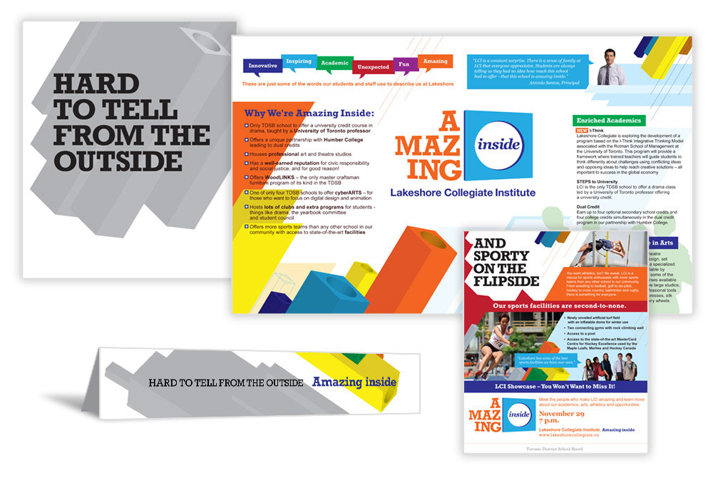
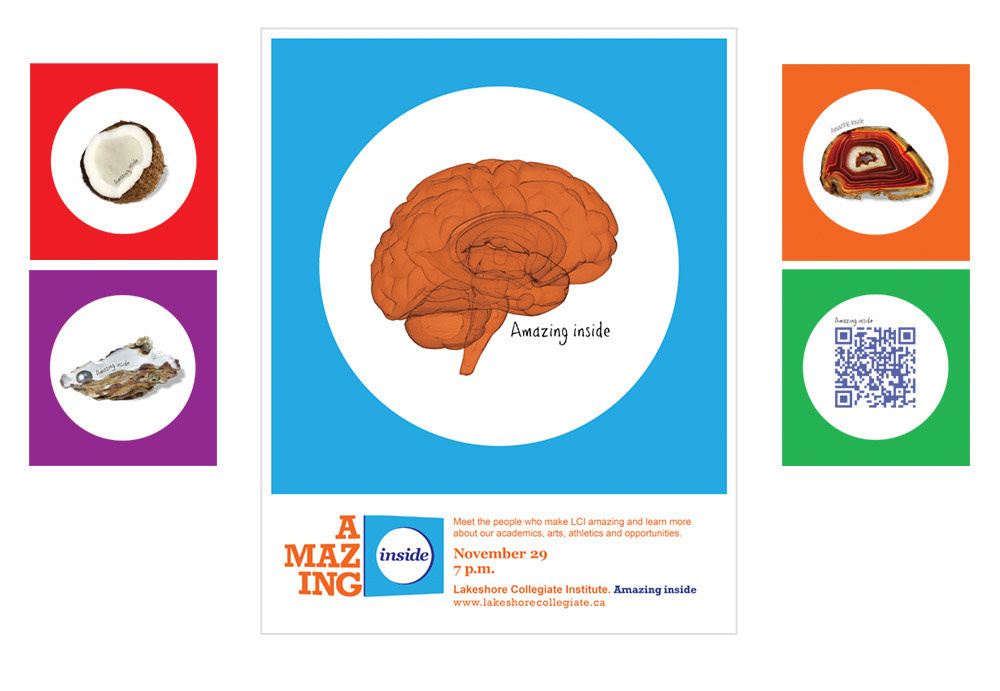
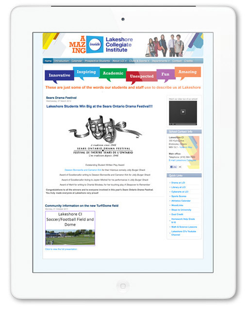
The campaign introduced a bold new visual identity inspired by a large sculptural landmark at the school's entrance, a tribute to its roots as a trades-focused institution. The circular form became the foundation of the campaign, appearing in a variety of applications including dimensional graphics, vibrant colour treatments, and graphic frames that unified print, digital, and environmental materials.
The new identity resonated strongly with the school community. The administration even repainted the entrance sculpture in the campaign's signature blue, extending the brand into the physical environment.
The campaign extended across print, digital, environmental graphics, advertising, and promotional materials and produced measurable results, contributing to increased student enrolment and a 300% increase in website traffic.