Brand Identity System
The Toronto District School Board is Canada's largest school board and one of the largest in North America. Although the organization had an established corporate logo, it lacked a modern, cohesive visual identity that could be applied consistently across its communications.
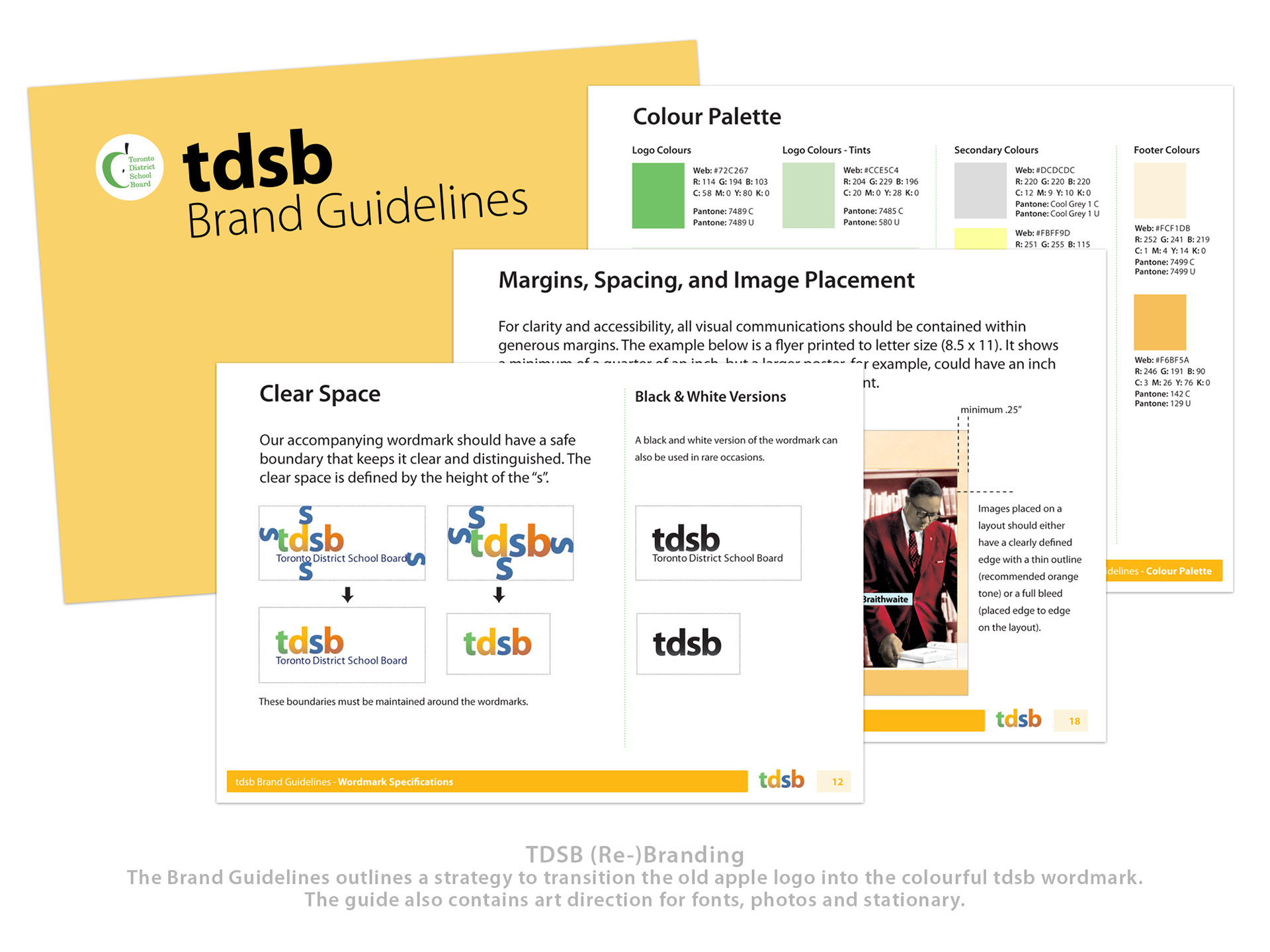
To address this, I created a new wordmark based on the board's widely recognized acronym and introduced a four-colour visual system that reflected the diversity, energy, and optimism of public education. To support its implementation, I developed a comprehensive brand standards guide, logo variations, and a library of supporting assets for use across print and digital communications.
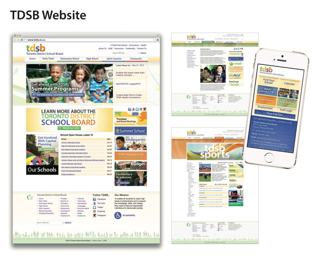
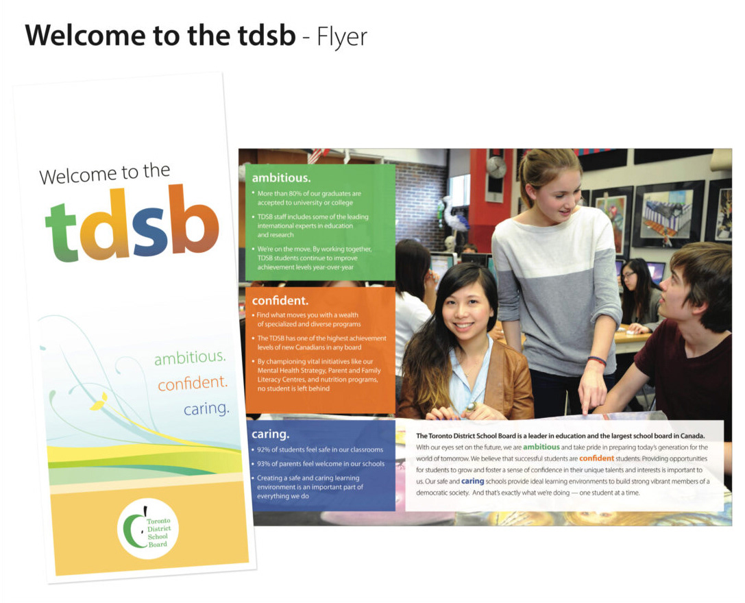
I championed the new identity throughout the organization and presented it directly to the Director of Education. Following approval, the wordmark and visual system became the official brand identity and were adopted across the school board's communications. The result was a simple, flexible identity that gave the organization a consistent visual language across hundreds of schools, departments, and communication channels.