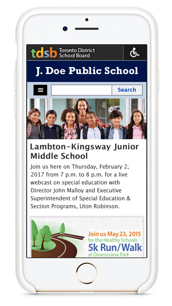
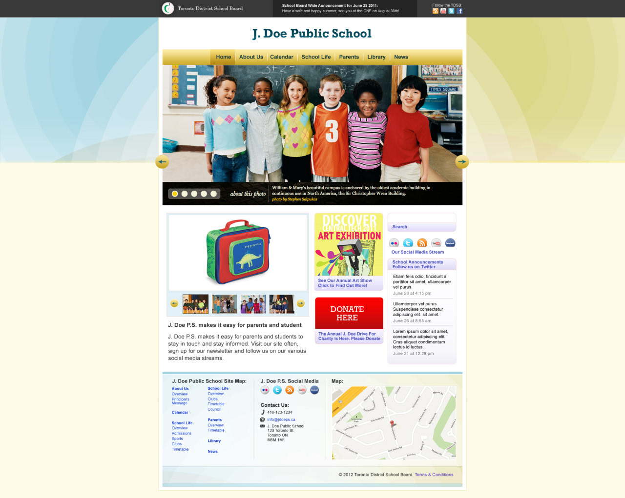
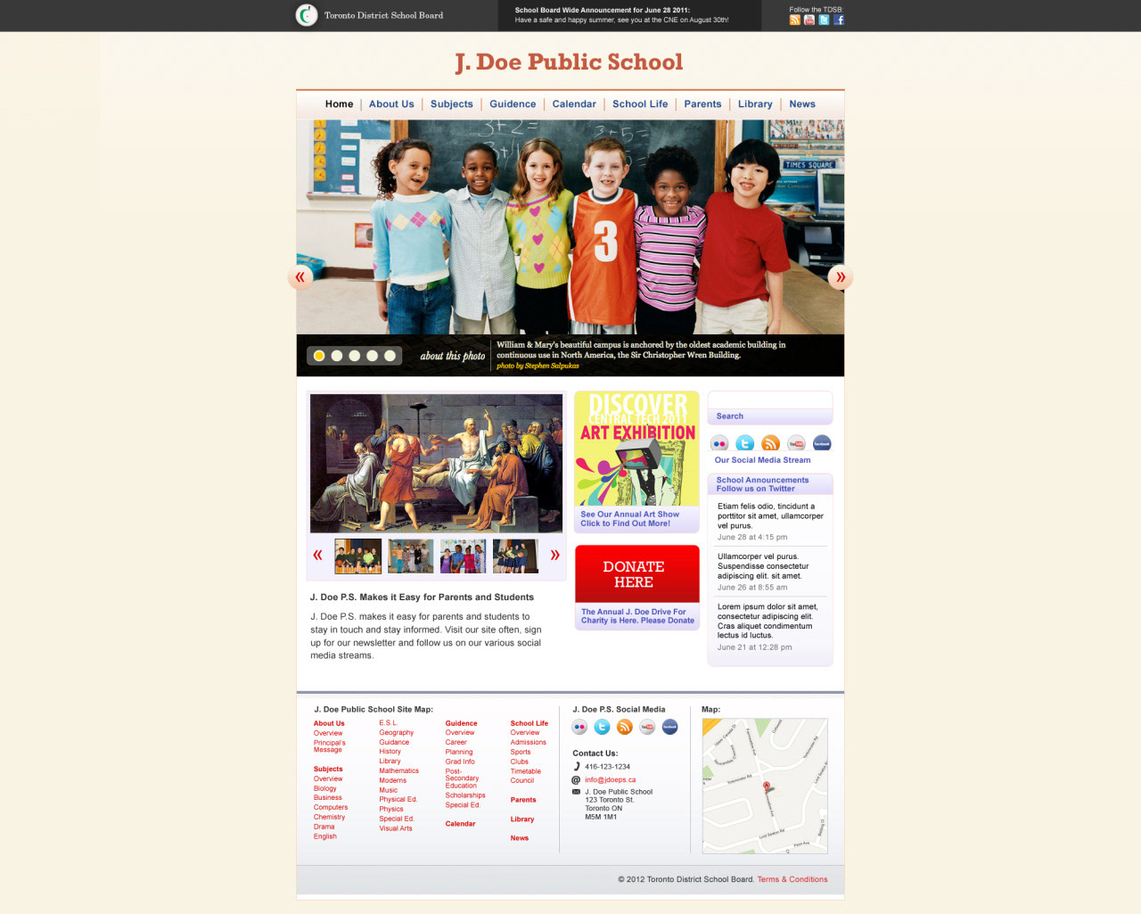
I developed a series of website templates for both elementary schools and secondary schools that were all accessibility compliant as well as responsive for any device the user may be on.
As an added UX feature I designed extra accessibility options in the form of colour coded buttons that can change the website from the current style to one of high contrast, one of low contrast and one for dyslexic users that uses a special font and a specific colour scheme.
From a communications stand point, it is important for an organization as large, and as complex as Canada’s largest school board to be able to push messaging to each school’s website. With this in mind I incorporated several options to push such messaging. The board reserves a graphical promotion on the home page of each website, as well as several types of alerts that appear along the top of a website such as snow-day alerts, or lock downs etc.


