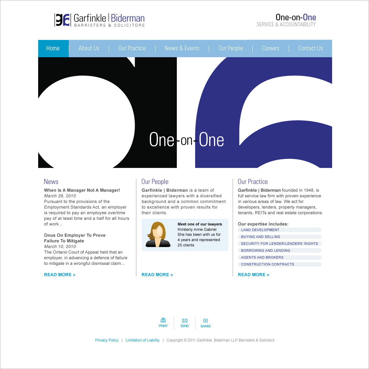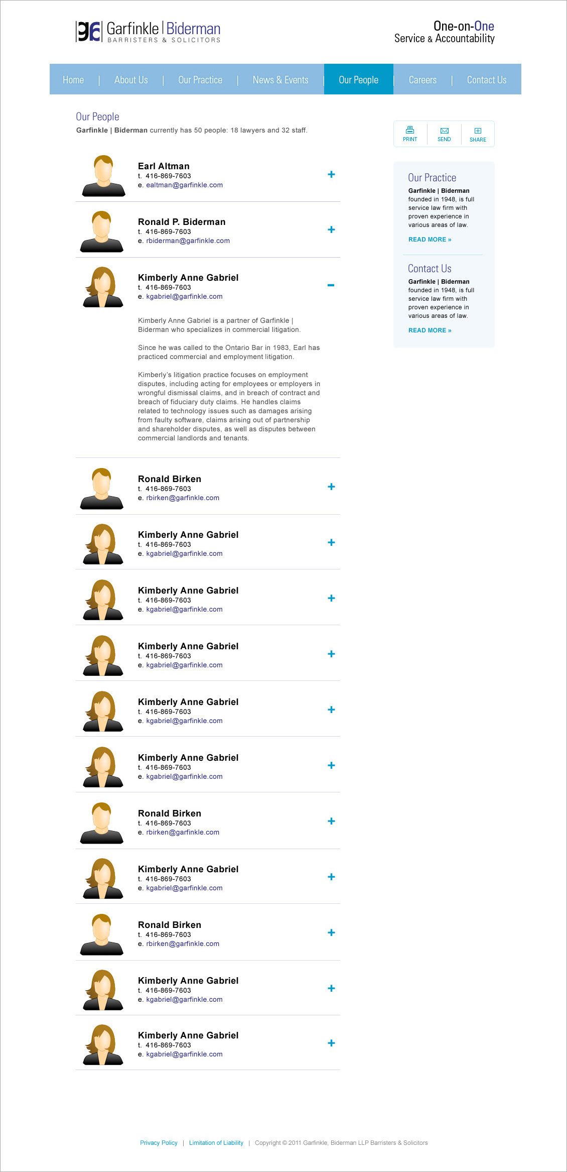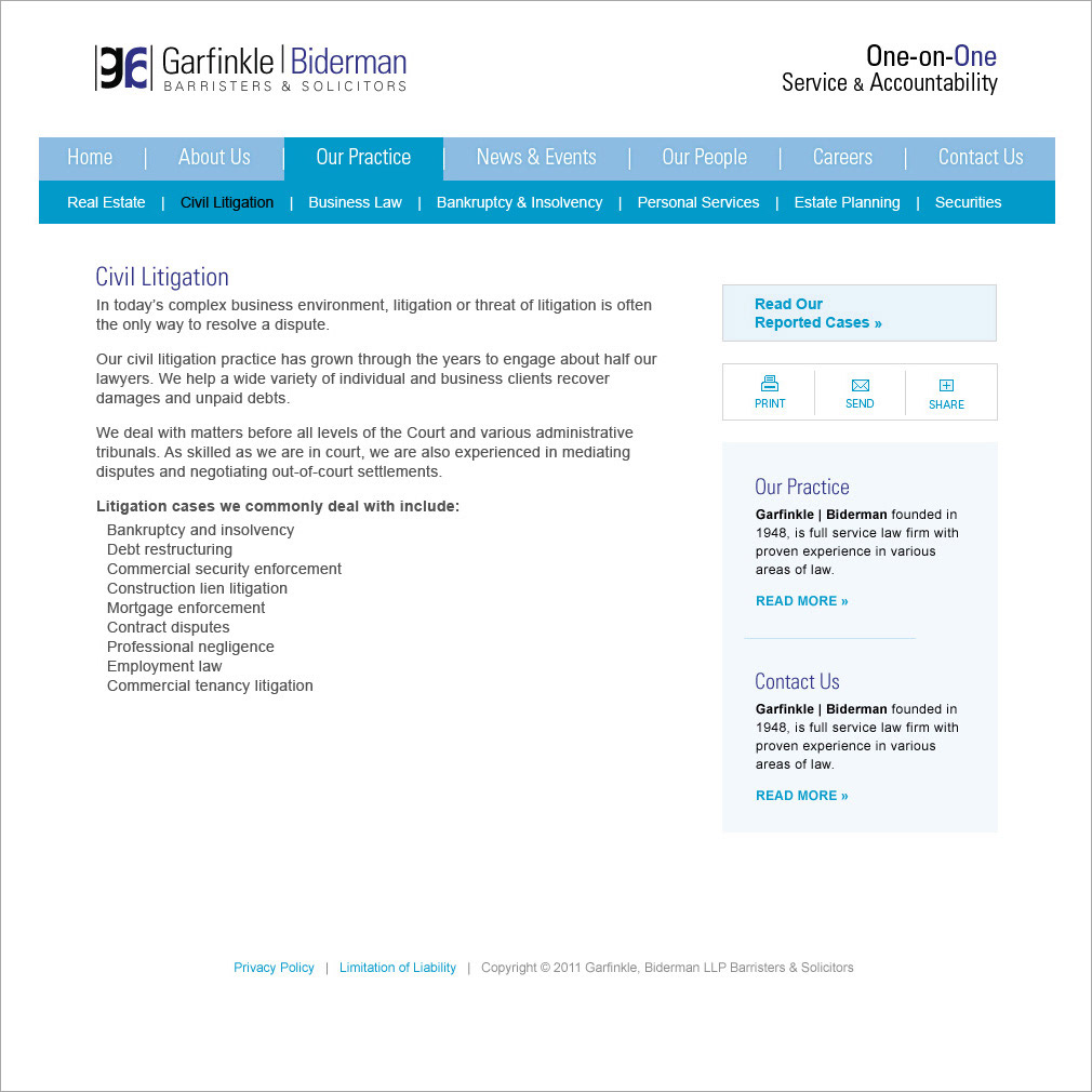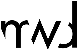
Our research taught us that the client was operating in a very competitive landscape that was cluttered with cliché logos, such as lighthouses, scales of justice and gavels. Although the logo I developed was based on the scales of justice, the interesting way the G and B initials of their firm worked together created the illusion that the metaphor was made just for them. The website is a clean and professional design that incorporates the firm’s logo as a design element. In the end the clients were very happy with their web presence and branding.