A naturopathic doctor needed branding and an online presence so we devised a plan to differentiate him from his competitors by leveraging a modern and deceptively simple logo, website, stationary, photography and blog.
Research:
Market research, user personas, and brand landscape exploration revealed to us the language, colour scheme and expectations for the potential clientele that would engage with the brand.
Market research, user personas, and brand landscape exploration revealed to us the language, colour scheme and expectations for the potential clientele that would engage with the brand.
Ideation:
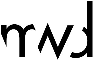
Several explorations were produced and eventually narrowed down to the logo you see. It incorporates life and the natural aspects of his practice through the suggestion of a leaf within the negative space. Balance is achieved in the circular containment of the leaf with a yin and yang balance of the green (earth) and blue (water and sky).
Several explorations were produced and eventually narrowed down to the logo you see. It incorporates life and the natural aspects of his practice through the suggestion of a leaf within the negative space. Balance is achieved in the circular containment of the leaf with a yin and yang balance of the green (earth) and blue (water and sky).
The logo is carried throughout all of the stationary, including a prescription pad, business cards, and refrigerator magnet. The website is a simple, modern responsive design with a video of a forest playing in the background. Large custom photography shows Dr. Gabriele at work with a client. There is an option to book an appointment, as well as a storefront for easy purchase of naturopathic medicine and supplements. A blog is maintained by the client as further proof of his expertise, as well as to boost his SEO.
The overall presentation situates Life Balance as a serious, trustworthy provider of naturopathic medicine.
